DICA
Crisis and adversity navigation app — designed for high-stress, high-volume public use

Info
Tags: UI/UX | Brand | App | IconDesign | Visual Identity
Duration: 08 Weeks.
Company: Independent Stakeholder
Team Members:
Product Manager and Research - Mauricio Euclides | Lead Designer - Isis Atena | Developer: John P. Sandall
08
03
02
02
Weeks
Team Members
Iterations
Languages
What is DICA?
D.l.C.A., in Brazilian Portuguese, is an Acronym for "Assistant Guide for Complications, Crises, and Adversities."- (Direcionador em Intercorrências, Crises e Adversidades.) This is also a word that means "tip" in free translation.
What is it?
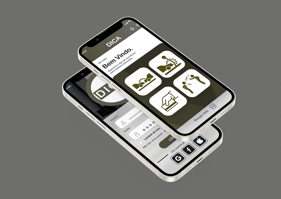
Car Assistant App for 80K users a day.
A state-connected Mobile guide for Complications, Crises, and Adversities.
What is it designed for?
Assist the user with day-to-day incidents quickly, easily, and clearly.
How does it work?
It troubleshoots crises in a simple to-do list style.
Research
Pain Points
A Every day, in the city of São Paulo - Brazil, alone, СОРОМ (Military Police Communications) receives approximately 80,000 calls on 190 phone lines, ranging from requests to respond to strictly police emergencies - pleas for help in case of robbery, as well as to obtain information for less severe cases - Traffic Accident Without a Victim, Loss of Documents and the like, but at that moment such less extreme occurrences are occupying the lines to the detriment of a more severe occurrence being attended to.

Goals
⬛️ It offers a simple App for the population that will guide them step-by-step through their adversities.
⬛️ The simplicity comes in a to-do list design.
⬛️ It declutters the Police phone line to let them attend to the most severe cases.

Challenges
Within the circumstances of this scenario, we found it helpful to work on the following topics to meet the identified demands:
⬛️ Area Division - Where to go, based on the location of the occurrence or adversity?
⬛️ Institution / Public Apparatus - With whom must one interact to present the fact?
⬛️ Information and Data - What types of data must be collected and processed to serve as a basis for resolving the case?
⬛️ Subsequent Monitoring - how, after starting the appropriate procedure, can the progress be monitored and analyzed (of the cases and the actual progress towards its conclusion?
User Journey Map
In this study, using the research provided by the stakeholder, I could refine the research into two personas:


Here, you can see how the adversities happen and how the D.I.C.A. App can be helpful in guiding John and Sandy. You can see a collection of thoughts and how they found their solution.


Solution
Specific Objectives
The range of situations and applicability can be very varied. However, we started developing the application focused on topics that affect people more frequently in one of the areas that most afflict the Brazilian population.
Public Security
From the simplest to the most complex cases, it is possible to give the appropriate guidance and a "tip." - "Dica, in Brazilian Portuguese".
Some cases that may be related:
▪️Traffic Accident WITH Victim.
▪️Traffic Accident WITHOUT A Victim.
▪️Banking Crimes - Card Cloning and subtracting money amounts from a Current Account, for instance.
▪️Crimes against honor - injury, defamation, or slander.
Language
These topics were presented in Brazilian Portuguese and English for Localization, keeping in mind tourists who do not have fluent Portuguese.
The Design
User Flow


Project Screens.

*Source and Image: Adobe.com
Inspiration and Accessibility
Inspiration
The color inspiration comes from the red traffic signs spread throughout the city.


Acessibility
Having in mind Color Blind users, it needs to be considered not pure red; instead, it is something that stands out, with the right contrast without causing any confusion.
Color Blindness Study

Default view
Protanopia :: Red Blindness

Deuteranopia :: Green Blindness
Moodboard
Pursuing a color set that would not in pure red, l've been initially into some Al generated layouts and, eventually, I came across my former Bank App color scheme in Brazil that gave us some good insights.


Mockup Screens


Prototyping
Mid-Fi and Hi-Fi Wireframing.
Check my Figma file at the top of the page to have an interactive view of my design. You can access multiple pages with Lo-fi and Hi-fi Wireframes, and also see interactions and User Flow!


Iterations
Here is the evolution of the design of this app so far. There is still a lot to do, but that's the Iteration Cycle! We were continually improving.


Iterations in chronologic order.
Future Considerations
This is a Work in Progress, and the main stakeholder, the creator of this idea, put this project on hold because another one of his Apps is in progress, and already in the prototype stage.
Maurício Euclides gave me the green light to use this app with the purpose of presenting this case to my future stakeholders and companies.
I look forward to continuing to design this helpful App, and I am sure more iterations, studies, and usability tests will come until the launch day.